
The Dusty Bookshelf

The Dusty Bookshelf is a local bookstore located in the metropolitan area. The Dusty Bookshelf strives to provide the surrounding area with a reliable and informative platform to purchase books. They offer a wide range of books, reading clubs, and events. The Dusty Bookshelf targets a range of customers from early readers to avid readers.
My Role:
UX designer designing a website for The Dusty Bookshelf from conception to delivery.
Responsibilities:
Conducting interviews, paper and digital wireframing, low and high-fidelity prototyping, conducting usability studies, accounting for accessibility, and iterating on designs.
The Problem:
Busy workers and students need a quick and effective way to buy books online.
The Goal:
Design a website for The Dusty Bookshelf that allows users to purchase a book or find a book club or event that fits their interests.
User Research: Pain Points
Language
Users want translation options to make their purchasing experience easier.
Inventory
Users want to know if a book is in stock when they search online, as well as a large selection of genres and books.
Community Engagement
Users want opportunities to engage with each other through book clubs, author visits, or other community events.
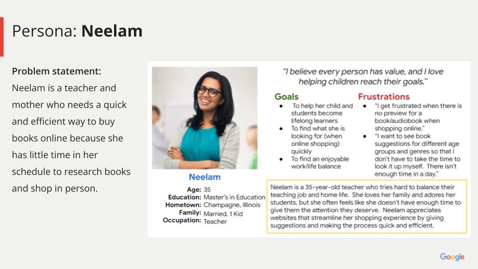
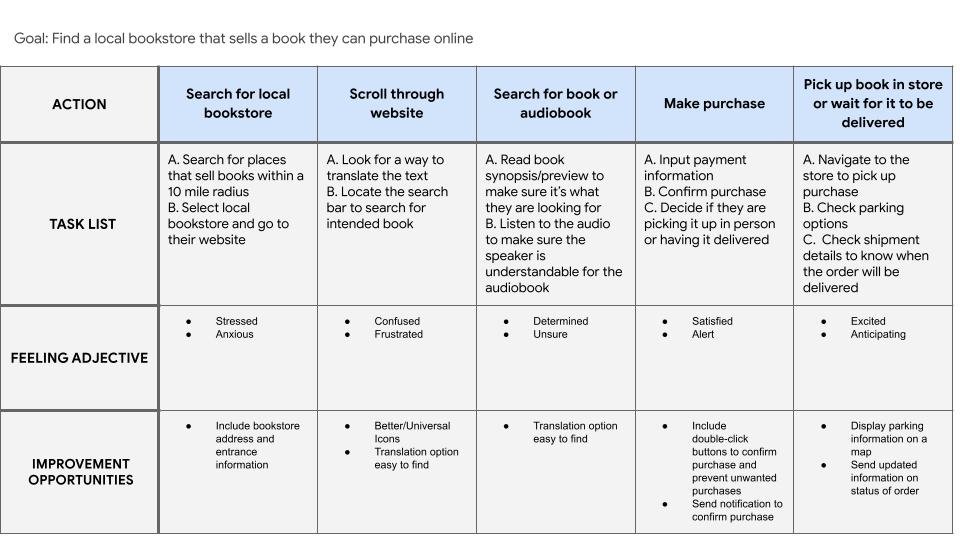
Personas and User Journey Maps

Wireframes
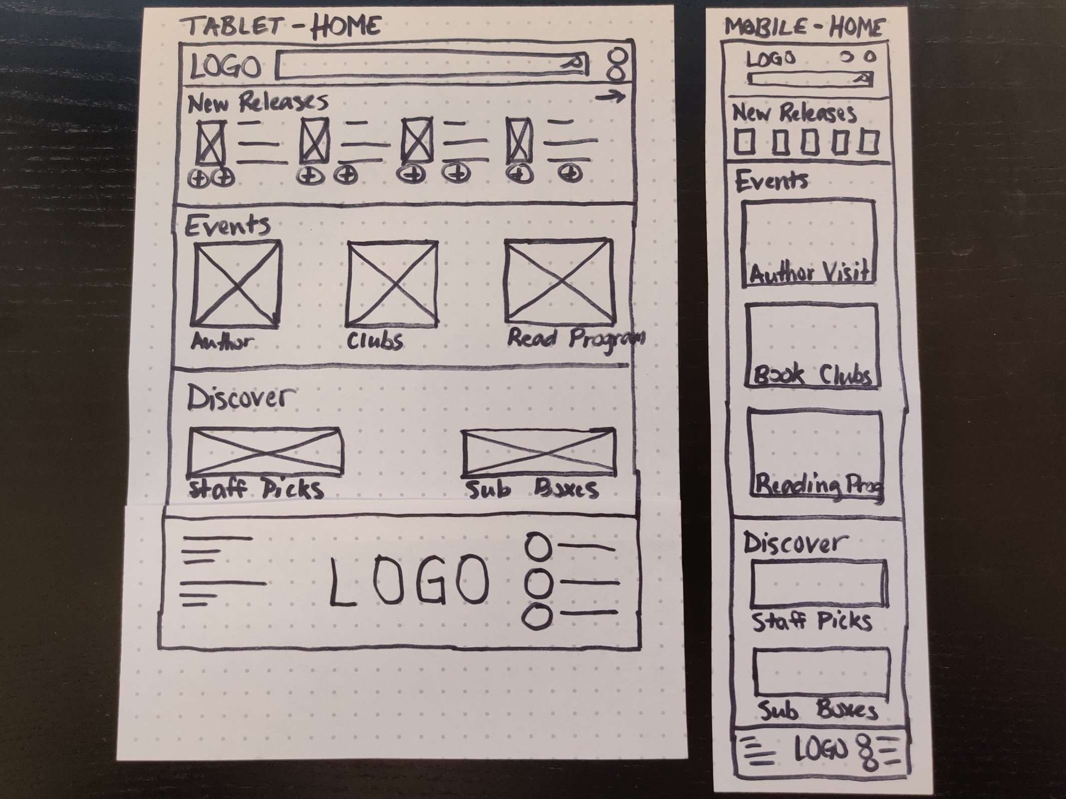
I began drafting iterations on paper for each screen of the app. Because users access the website on different screens, I began to construct additional screen sizes to make sure the site would be fully responsive
After refining the iterations, I created digital wireframes.
As the design process continued, I made sure all of the designs and iterations were founded on feedback and research.


Low-Fidelity Prototype

The completed wireframes were used to create a low-fidelity prototype.
I prioritized the user flow of choosing and ordering a book, so that this prototype could be used in a usability study.
View The Dusty Bookshelf’s Low-fidelity prototype
Usability Studies
I conducted two rounds of usability studies. Findings from the first study helped guide the designs from wireframes to mockups. The second study used a high-fidelity prototype and revealed what aspects of the mockups needed refining.
Round 1 Findings:
Features are too close together and visually overwhelming
Users want translation options
Users want the product to be the main focus on each page
Users want more navigation options at the top of the page
Round 2 Findings:
Users want the product to be larger so they can see them easily
Users want the text to be larger so it’s easily seen
High-Fidelity Prototype

The final high-fidelity prototype offered intuitive navigation and a cleaner ordering process for users. It also met user needs by provided a personalized experience through loyalty rewards and personalized recommendations.
View The Dusty Bookshelf’s High Fidelity Prototype
Accessibility Considerations
Included a translation option to allow for different languages
Used headings and fonts of different sizes for clear visual hierarchy
Consulted ADA guidelines to ensure color palette was suitable for all users
Impact:
The users felt the design was simple and easy to navigate, and appreciated how the images added to the experience that left an impression on them.
One quote from a usability study:
“I appreciate all the different options that help people searching for a book like the recommendations and search filters!”
What I Learned:
I always find it amazing how helpful the usability studies are for ensuring an accommodation, intuitive design. The critiques and statements help to refine and polish the designs, keeping the user’s needs at the forefront.
Next Steps
Conduct another usability study to confirm whether pain points have been addressed
Continue to research about new concepts or ideas for the app
Refine animations, buttons and dropdown menus for a polished product as I continue learning about Adobe XD