
The Last Chapter

The Last Chapter is a local bookstore located in the metropolitan area. The Last Chapter strives to provide the surrounding area with a reliable and informative platform to purchase books. They offer a wide range of books and events. The Last Chapter targets a range of customers from early readers to avid readers.
My Role:
UX designer designing an app for The Last Chapter from conception to delivery.
Responsibilities:
Conducting interviews, paper and digital wireframing, low and high-fidelity prototyping, conducting usability studies, accounting for accessibility, and iterating on designs.
The problem:
Busy workers and students need a quick and effective way to buy books online.
The goal:
Design a mobile-web app for The Last Chapter that allows users to easily order or pick up a book that is just right for them.
User Research: Pain Points
Time
Working adults are too busy to spend time researching a new book for themselves or peruse the bookstore shelves for hours.
Community Engagement
Users want opportunities to engage with each other through book clubs, author visits, or other community events.
Inventory
Users want to know if a book is in stock so that they can order it or pick it up in person.
Personalization
Users want book recommendations that are tailored to their interests.
Persona: Neelam

Neelam is a teacher and mother who needs a quick and efficient way to buy books online because she has little time in her schedule to research books and shop in person.
User Journey Map: Neelam
Mapping Neelam’s user journey revealed how helpful it would be to have a personalized app for users to have recommendations, book clubs, and more.

Wireframes
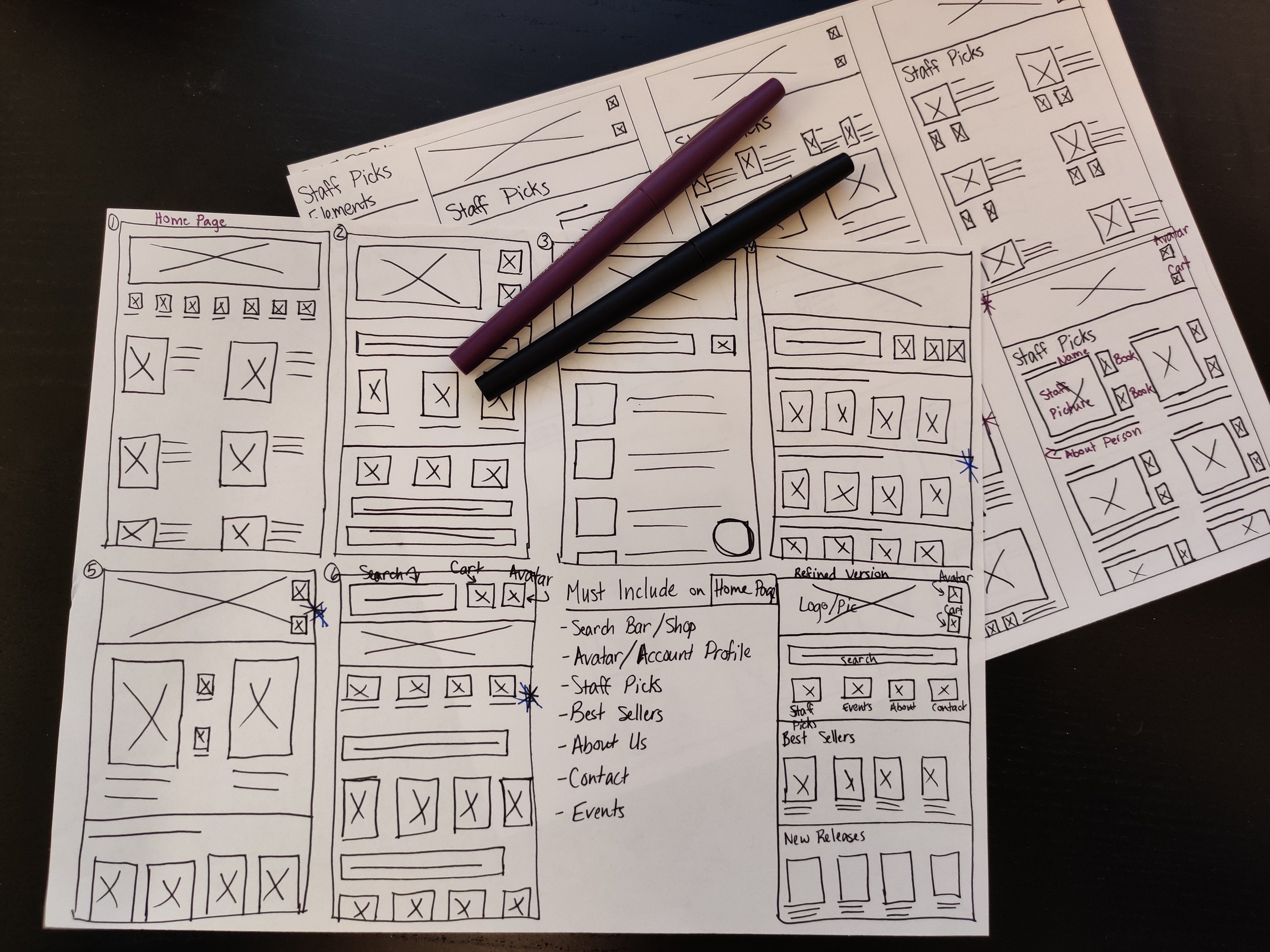
I began drafting iterations on paper for each screen of the app.
After refining the iterations, I created digital wireframes.
I prioritized simple, efficient designs to help users save time.


Low-Fidelity Prototype

The completed wireframes were used to create a low-fidelity prototype. I prioritized the user flow of choosing and ordering a book, so that this prototype could be used in a usability study.
View The Last Chapter’s low-fidelity prototype.
Usability Studies
I conducted two rounds of usability studies. Findings from the first study helped guide the designs from wireframes to mockups. The second study used a high-fidelity prototype and revealed what aspects of the mockups needed refining.
Round 1 Findings:
Users want intuitive scrolling features.
Users want the CTA button in a more purposeful placement
Users want the product to be the main focus on each page
Users want the product to be the main focus on each page
Round 2 Findings:
Users want the product to be larger so they can see them easily
Users want the cart and checkout payment to be consistent

High-Fidelity Prototype
The final high-fidelity prototype offered users intuitive navigation and a cleaner ordering process. It also met user needs by providing a personalized experience through loyalty rewards and personalized recommendations.
View The Last Chapter’s High Fidelity Prototype
Accessibility Considerations
Used icons and a clear hierarchy of information to aid in navigation
Consulted ADA guidelines to ensure the color palette was suitable for all users
Provided alt text for each image to enable screen readers to navigate each page
Impact:
The mobile-web app personalizes the book shopping experience and makes users feel like their interests are valued.
One quote from a usability study:
“I really like how easy this is to navigate! I wish I had an app like this that was able to recommend books to me based on my purchase history and interests!”
What I Learned:
The usability studies and peer feedback are truly invaluable. Those critical reviews helped to refine my designs and provide a simple, intuitive book shopping experience.
Next Steps
Conduct another usability study to confirm whether pain points have been addressed
Continue to research about new concepts or ideas for the app
Refine animations, carousel, and dropdown menus for a polished product as I continue learning about Figma